Objective
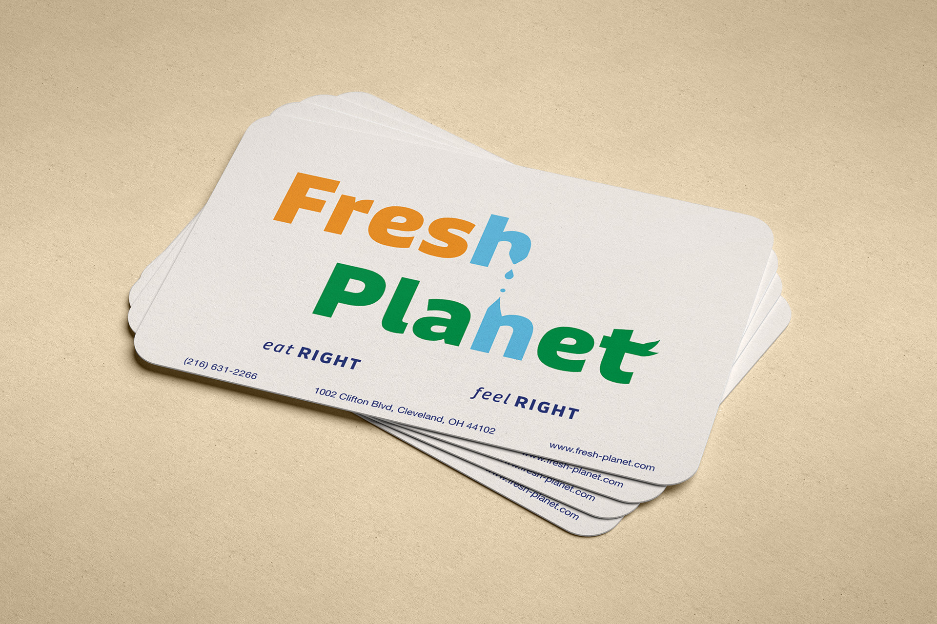
Redesign the Fresh Planet logo to make it visually appealing, attract new customers to the restaurant, and communicate what to return. Give it a clean, modern look that reflects the shop's message.
Fresh Planets Old Design

The old design, it was very retro, with many warm colors. The factors that represent Fresh Planet are that their main focus is clean foods; the emphasis is placed on feeling good about what you're eating.
Sketches
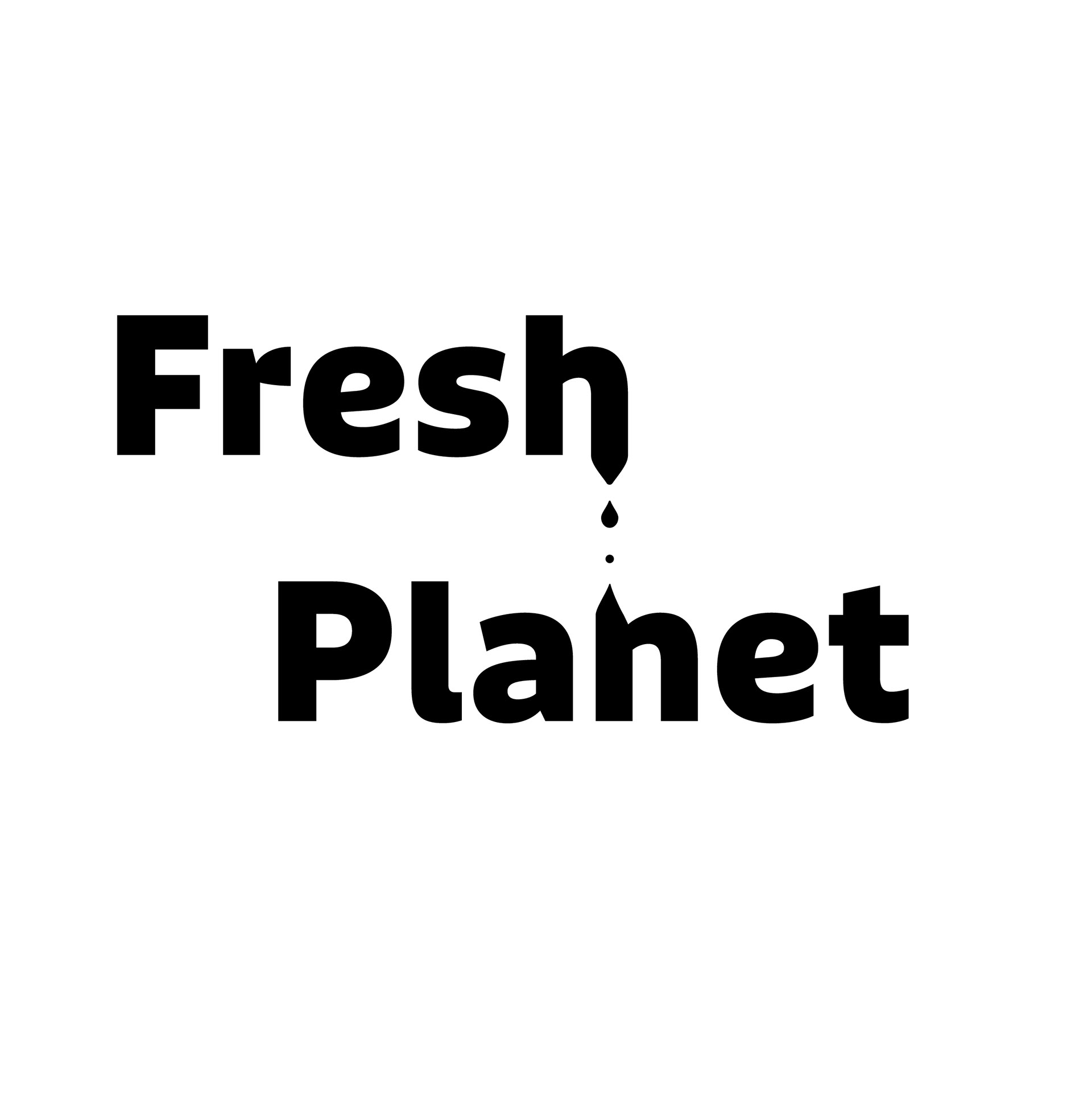
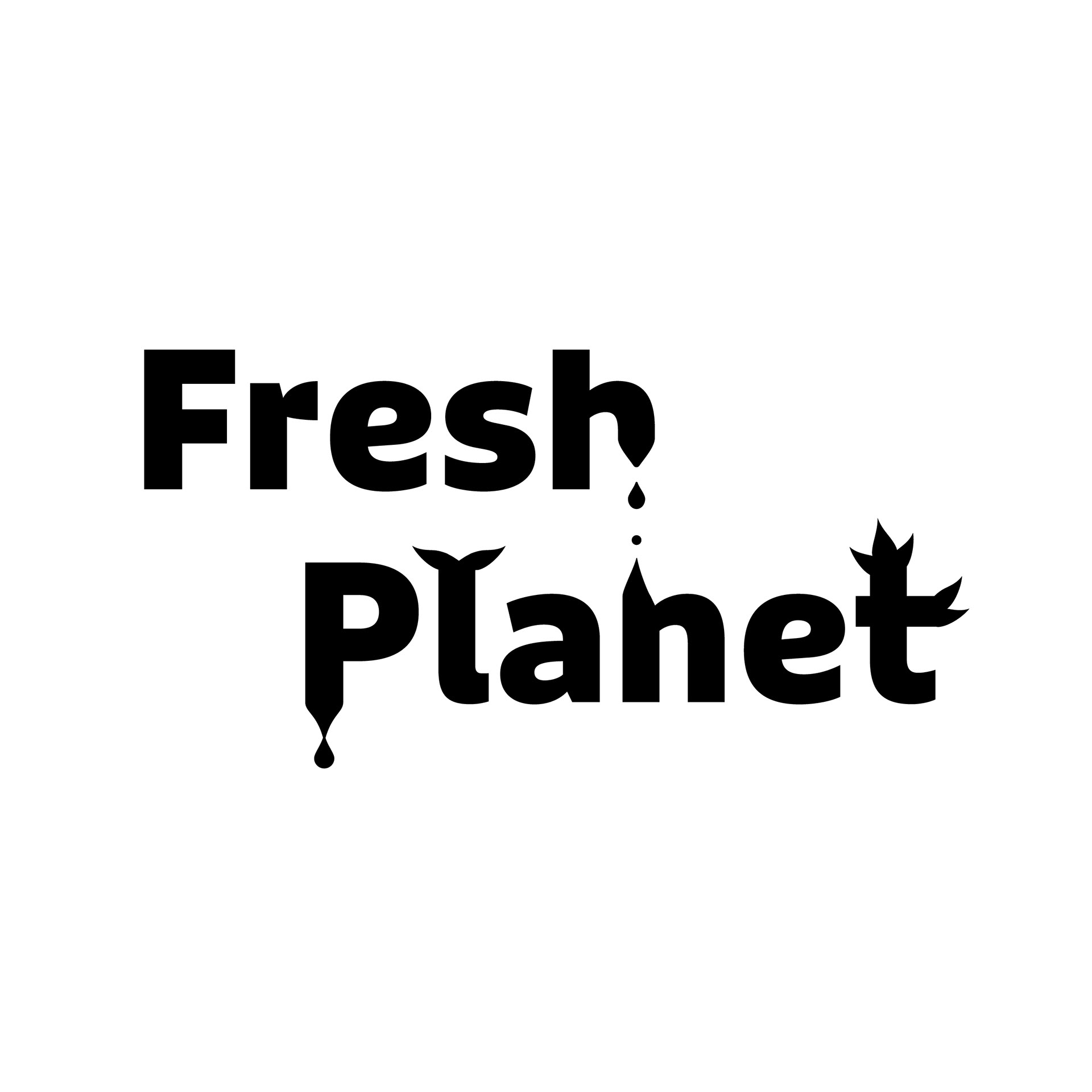
Wanted to focus on elements that represent the name Fresh Planet and the motto "eat right, feel right," such as water, a planet, and an overall clean look.


Color Application
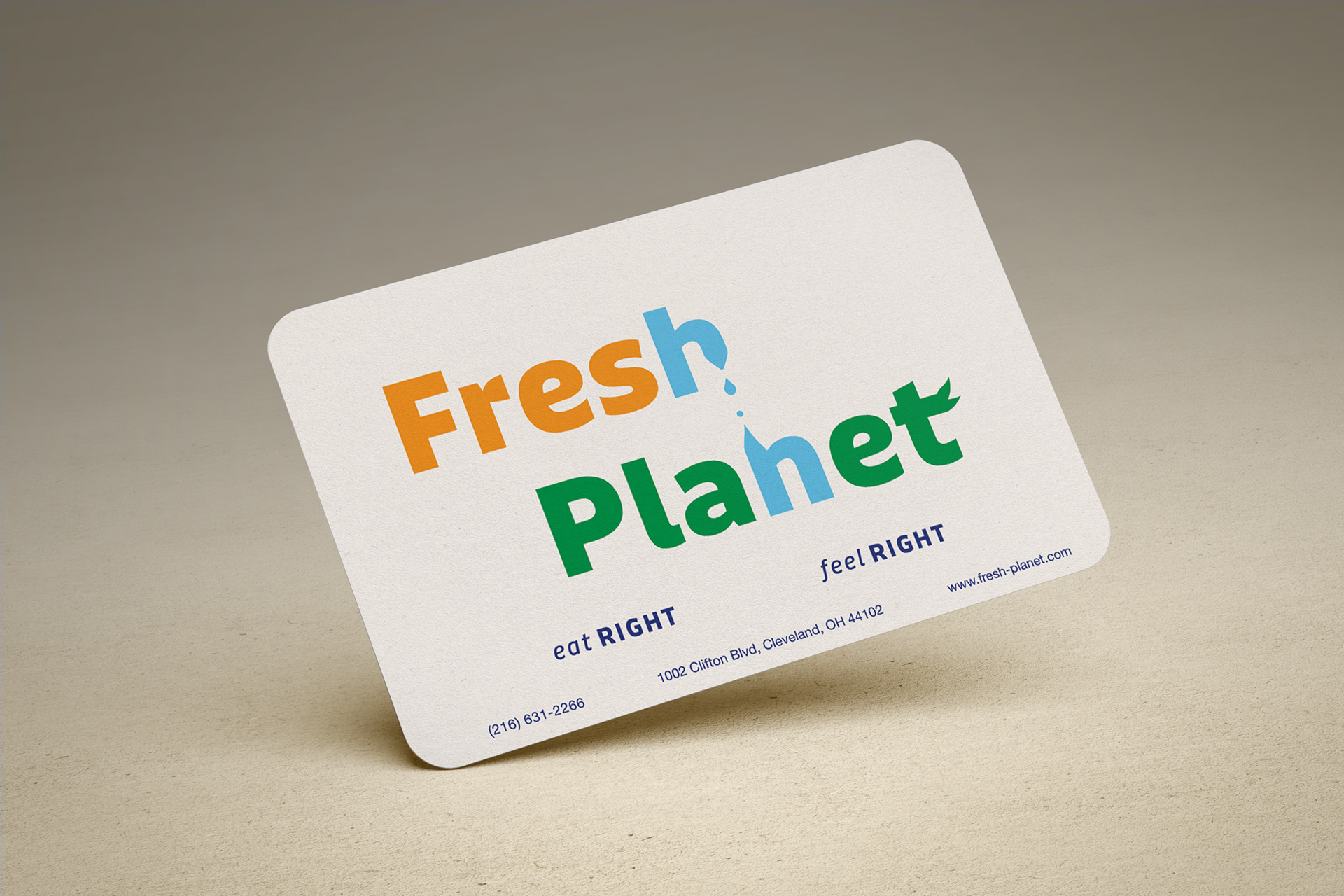
Focused on highlighting the different elements that are important and how they will be conveyed to the viewer at a quick glance. While still maintaining that warmth with the orange, add more of a fresh feeling with the blue and green.



Type
Color Studies
Puffin Display
Shout
Talk
Whisper

Appliction
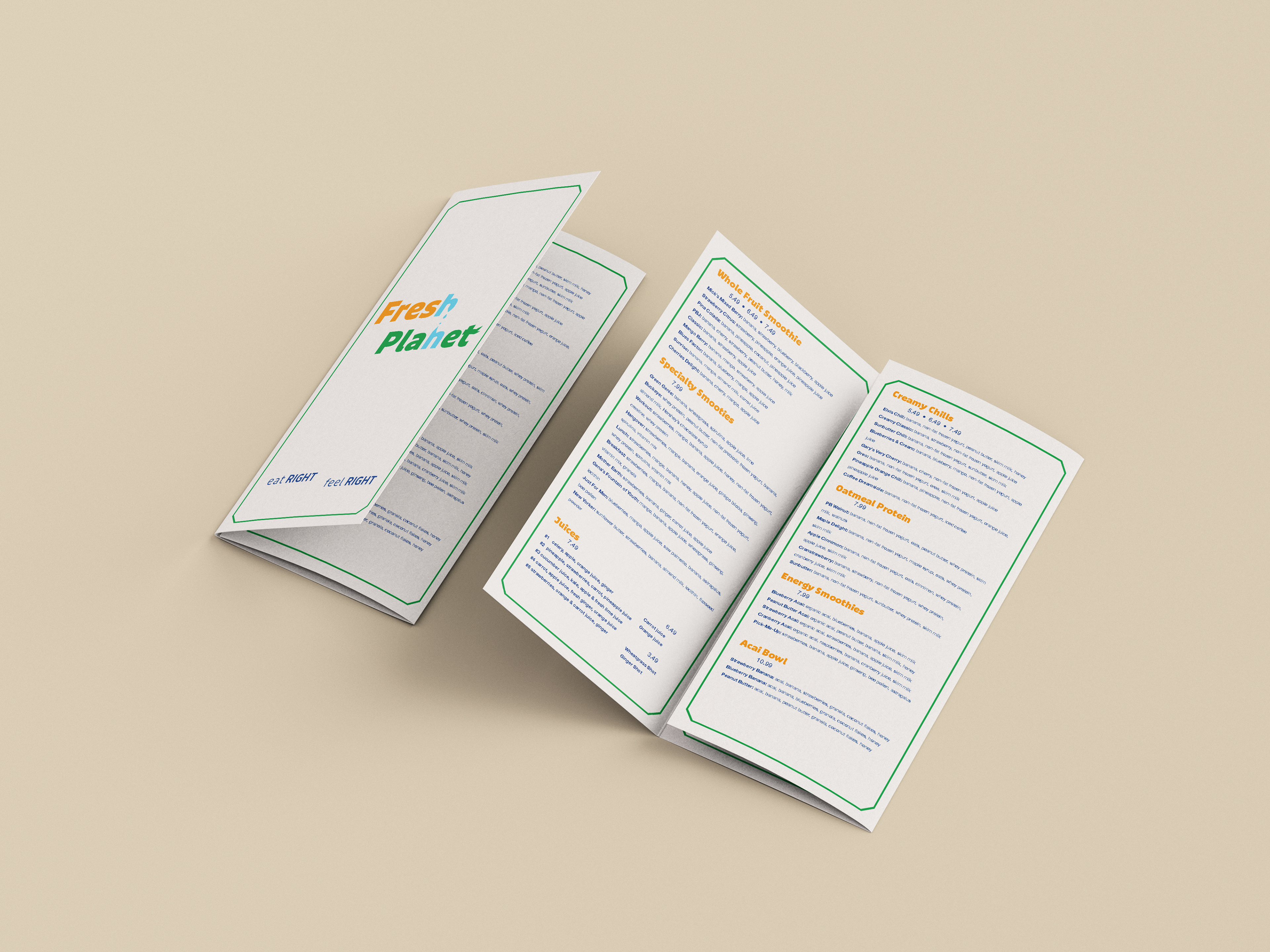
Takeout Menu
Looking at how the wordmark can be added to small menus, and understanding that layouts and color can affect how the wordmark works with other materials.