Objective
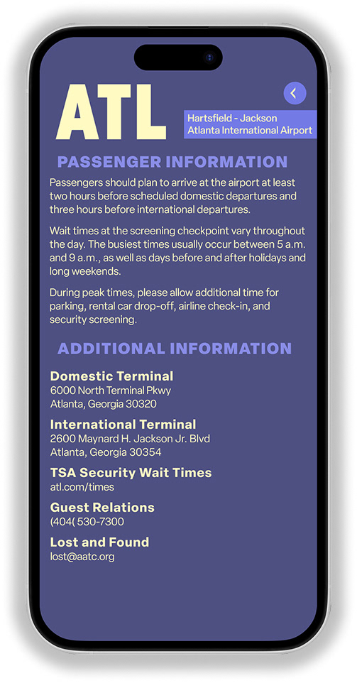
The purpose is to create an easily accessible interface that can be quickly navigated, highlighting the important factors while also encouraging users to return to the app.

First Sketches & Digital Drafts
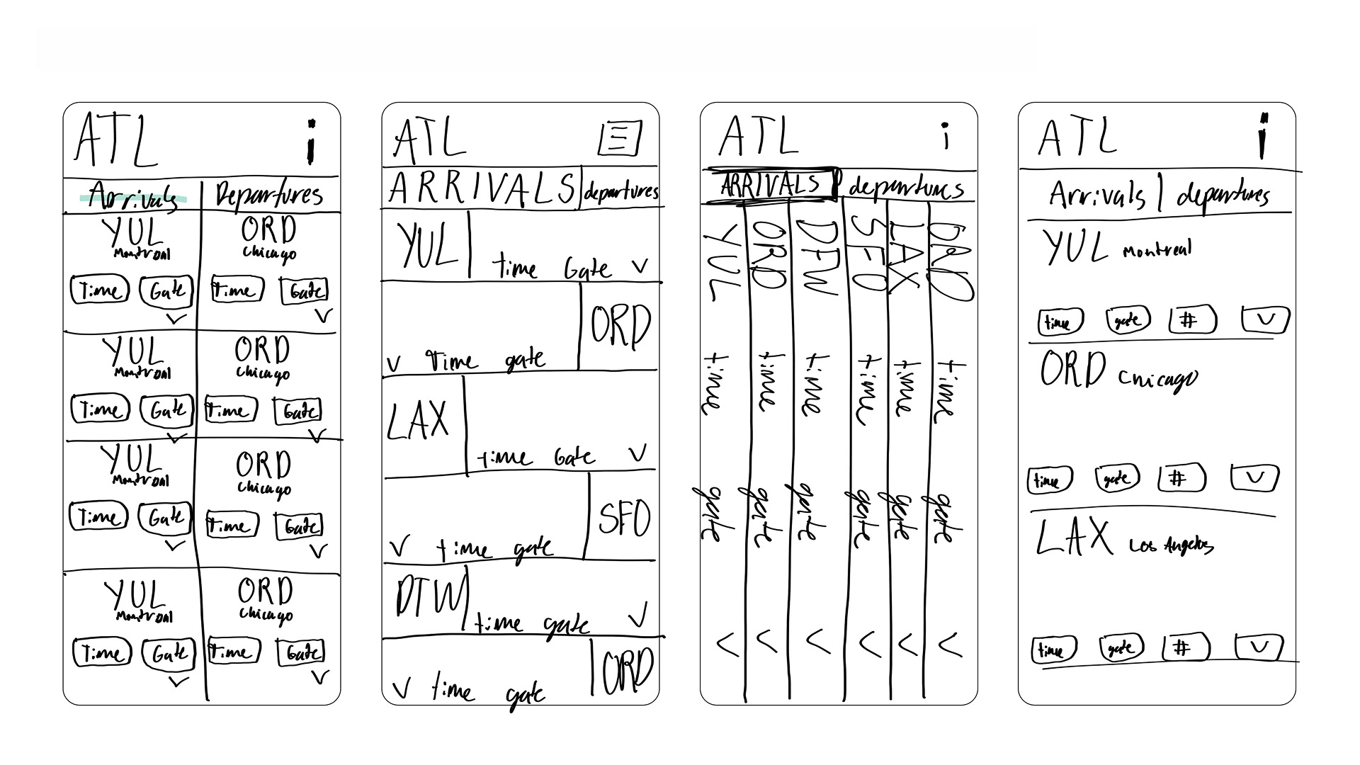
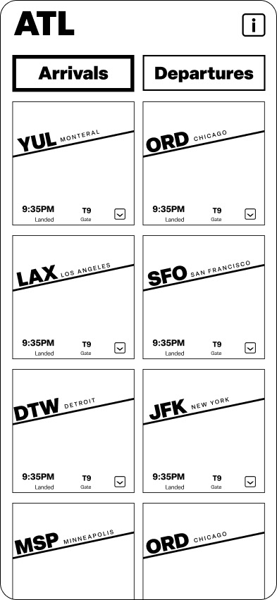
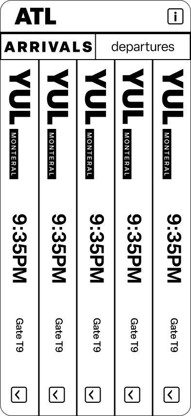
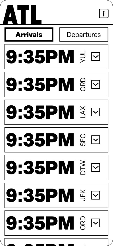
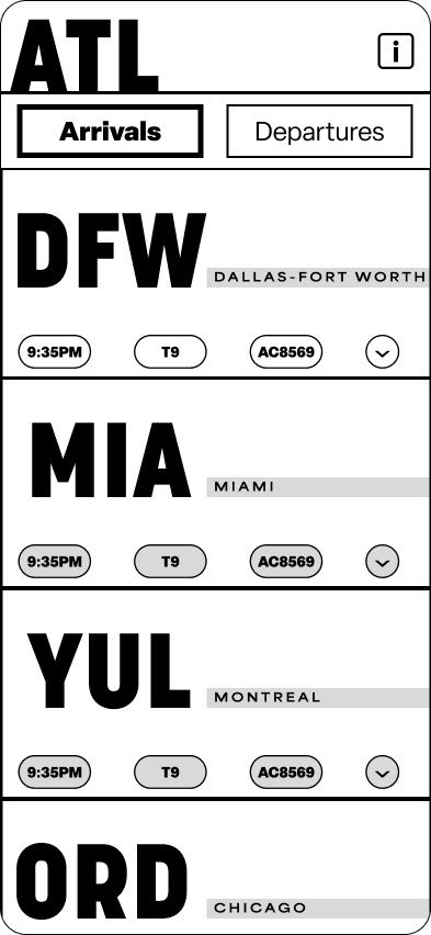
First started out working physically on paper to get an overall feel for understanding the organisms that make up the app. Then, working digitally, the focus shifted to working with the space within the size of the screen and how the type size interacts with space.
Color Application
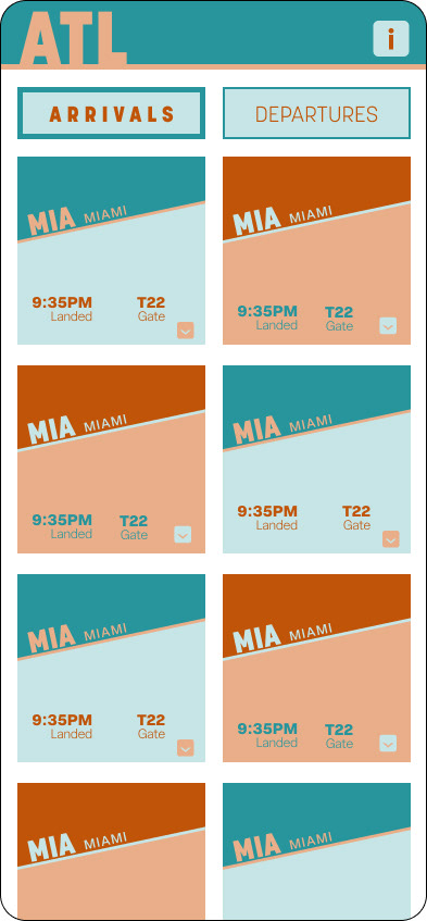
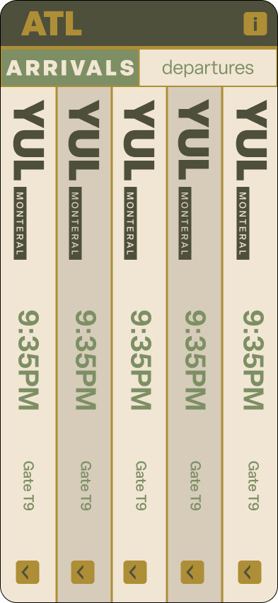
With color, there were many considerations about how they make a user feel while using the app. It is focused more on a calm environment with softer colors that might create a more relaxed feeling while using it.
Type
Color Studies
Korolev
SHOUT
Area Extended
TALK
Elza
Whisper

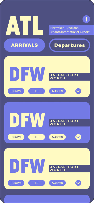
Final
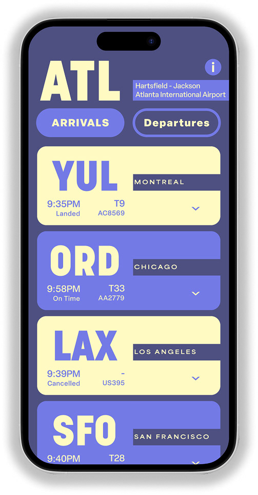
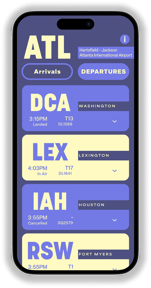
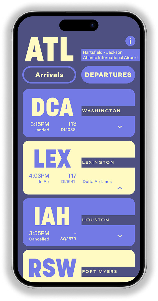
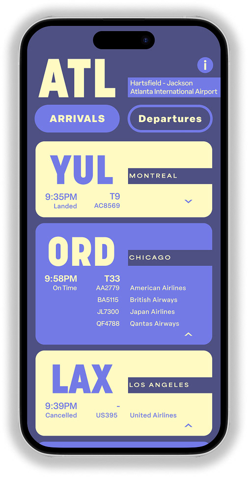
Originally, the information was separated by pill shapes, which created more information to look at than what was actually there, similar to the draft above. After changes to the organization, the information is grouped more cohesively to create less separation and make it easier to read quikely.